Wednesday, April 21, 2010

Return to the White Cube

re:View closed this past Saturday, and on Monday de-installation began.  Myself and the other four students joined the preparators and curator of the museum and helped to take it all down.  Jayme took down her wall text, making sure to save the photos of “Tom,” Raylene was busy putting many many paintings back into real storage, David hoarded all of his wall quotes, wall text, and labels, Lauren ejected her DVD…Actually, Lauren did a lot more than that, and was pretty fierce when it came to wielding a drill; she helped to removed the mountings that the Jinks Room murals had been attached to.

I was charged with the task of removing my “blueprint” from the Center Gallery’s floor.  What had taken two semesters to research, develop and execute, was removed and gone within five minutes.  The painted plastic sheets were ripped off the floor and were crumpled into a big heap.
 
Taking down our individual projects wasn’t the only thing that needed to be done; we also took down all of the wall text from re:View and from Four Rooms and a View, and also took down our big blue title.
 
What did we do with all of this trash?  Jayme turned it into a Lady-Gaga-inspired outfit, that she plans on wearing out this weekend in Hollywood.—Just kidding.  After prancing around with all the discarded plastic Jayme tossed it.

Some people asked me if I was going to try and save any of the silhouettes, m response was that my project was really about expanding the known knowledge about the murals.  All of the expanded research will be added to the museums file, and will be preserved there.  So saving the plastic sheets wasn’t really a priority of the project for me, so much as a creative way to display my research.

The museum galleries have once again been returned to the white boxes.  The next thing to go on display in the Fisher is the SOFA show, which will showcase works from students in the Roski School of Fine Art.  However one things remains from re:View, and will stay on view until fall.  Susan Silton’s work, which was commissioned for re:View still adorns the facade of the Fisher.  It reminds us, the student-curators of our project, and welcomes visitors into the museum, and asks them to question what they are seeing.


- Francisco Rosas

Thursday, April 15, 2010

Reconsider: On my reading list

Over the past week I have been reading Patti Smith’s recently published memoir Just Kids about her relationship with photographer Robert Mapplethorpe and her life in New York during the late 60s through the 1970s. Smith’s account of Mapplethorpe and their simultaneous pursuits in art, poetry and rock ’n’ roll is incredibly charming. I’m enthralled with everything she has to say—I love Patti. But aside from my personal infatuation, throughout the book Smith discusses the state of photography in the 1970s, recounted Mapplethorpe’s own movement toward the medium, deeply indebted to his relationship with curator and collector Sam Wagstaff, his patron and lover. Here Smith recanting her trips with Wagstaff and Mapplethorpe to purchase photographs, and how Wagstaff and Mapplethorpe’s personal interests in photography informed each other’s pursuits:


The three of us would scour Book Row, the dusty secondhand bookstores that once lined Fourth Avenue. Robert would go through boxes of old postcards, stereo cards, and tintypes carefully to find a gem. Sam, impatient, and not impeded by cost, would simply buy the whole box. I would stand aside listening to them argue. It sounded very familiar.

Scouting bookstores was one of my specialties. In rare instances, I would root out a desirable Victorian cabinet card, or an important portfolio of turn-of-the-century cathedrals, and on one lucky excursion, an overlooked Cameron. It was on the cusp of collecting photography, the last period where one could find a bargain. It was till possible to come upon gravure prints of large-format field photographs by Edward Curtis. Sam was taken with the beauty and the historical value of these photographs of the North American Indian, and acquired several volumes. Later, as we sat on the floor looking at them, in his large empty apartment flooded with natural light, we were impressed not only by the images but by the process. Sam would feel the edge of the photograph between his thumb and forefingers. “There’s something about the paper,” he would say.

Tuesday, April 6, 2010

Reconsider: Three for a dollar


The last Reconsider post discussed the unease with which the intervention displays non-art photography within a museum space given the medium’s historically problematic reception within art institutions. It did not however discuss photography in a broad sense, as a popular medium that has structured our understanding of history, others and ourselves, or photography as a ritualized mode of understanding in modern society. This is after all a vital facet of the intervention: that depicting the American landscape was radically altered through the photographic image—that the ability to capture, reproduce or purchase an image with considerable ease initiated a new understanding of the land in American society, one alternate to but equally embedded within the visual language of an early moment, being painting. In considering the scope of the “image-world” photography produced (here specifically related to the American landscape and the West), the twenty-one images displayed in Reconsider are not significant in themselves, through there are certainly captivating photographs. What I am interested in is the picture as examples of the vast amount of photographic images produced of the West at the turn of the century, many of which are now lost. These twenty-one images, produced for commercial, tourist or sentimental reasons, were saved and are the fragments of cultural production that have survived.

Written on back: "32"

Monday, April 5, 2010

"The Jinks Room, Remembered" Now Playing @ Fisher!

The final cut of the Jinks room documentary written by myself and directed by Grace Talice Lee is now on display at the Fisher Museum. The film entitled "The Jinks Room, Remembered" features six alumni of the Anoakia School (the original location of the murals). The project investigates memory and film documentation as a contemporary means of writing art history, and sheds light on the significant relationship between work and viewer, which is an important tool in gaining greater understanding of a work of art. Please come visit our show, running until the 17th of April.


Chronicle of Higher Education


The Chronicle of Higher Education ran a piece today about re:View: "Sorry, Museum: This Is For Your Own Good." Francisco, Jayme and Richard were quoted:
"In this case, the class really has become the exhibition. There's a certain kind of authority that you give up to the students. I love that, and it's also strange." - Richard Meyer

Band Branding

In addition to being an Art History major, I am a Public Relations major at the USC Annenberg School. When this class began, we were told that we, the student-curators, would be overseeing all aspects of this intervention project; this included publications and public relations. (Below: Exhibition Brochure with, and without the "bellyband.")

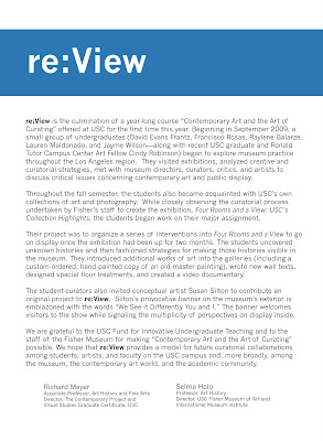
The publication that we created for re:View is an exhibition brochure, one that is exactly the same size as the existing brochure for Four Rooms and a View. We bound the two exhibition brochures together using a strip of paper called a "belly band."

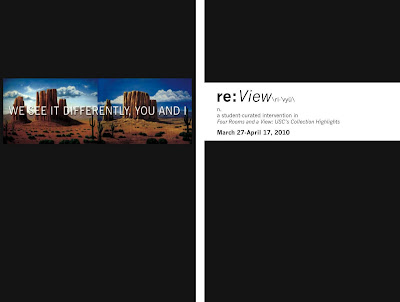
On the front of the belly band is Susan Silton's work that was commissioned specifically for re:View, and that now hangs on the Exposition-side of the Fisher Museum. Once this band is removed the two brochures come apart and the title for re:View is revealed. (Below: the exterior and interior of the belly band.)


On the exterior of the belly band are the titles of the five projects that were developed for re:View: Reconstruct, Remember, Reconsider, Reproduce and Retrieve. The title are in white text on a blue background. This color of blue, and the idea of the band became elements of the branding for the intervention. (Below: a walltext designed for re:View.
)The wall panels that were added to the museum for the intervention are distinguishable from those that remain from Four Rooms and a View because of their distinctive blue bands across the top of each panel. We also decided to intervene with the main title of the permanent collection exhibition; we designed a custom vinyl title for re:View that covers (but not completely) the title from Four Rooms and a View, and again uses the idea of the band.

Finally we extended this idea of band-branding outside the museum on posters in several locations. The concept was to create a subtle and savvy method to distinguish our student-curated intervention from the permanent collection show. (Below: posters outside the Fisher Museum.)

- Francisco Rosas

Retrieve: The Resulting Display

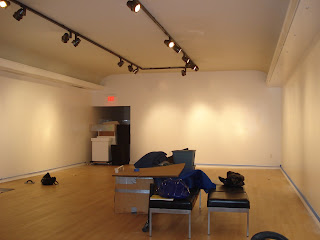
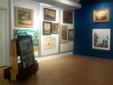
The transformation of the Quinn Wing is now complete, and will be on view through April 17. The once-virtually empty space now holds 35 landscapes in a storage-like display; the works include drawings, paintings and prints spanning from the 17th-21st centuries, some in greater condition than others, and many by relatively unknown (or even just unknown) artists. Here's just a glimpse of how things have changed:


--Raylene Galarze