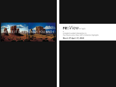
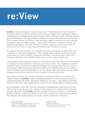
 The publication that we created for re:View is an exhibition brochure, one that is exactly the same size as the existing brochure for Four Rooms and a View. We bound the two exhibition brochures together using a strip of paper called a "belly band."
On the front of the belly band is Susan Silton's work that was commissioned specifically for re:View, and that now hangs on the Exposition-side of the Fisher Museum. Once this band is removed the two brochures come apart and the title for re:View is revealed. (Below: the exterior and interior of the belly band.)

On the exterior of the belly band are the titles of the five projects that were developed for re:View: Reconstruct, Remember, Reconsider, Reproduce and Retrieve. The title are in white text on a blue background. This color of blue, and the idea of the band became elements of the branding for the intervention. (Below: a walltext designed for re:View.)
 The wall panels that were added to the museum for the intervention are distinguishable from those that remain from Four Rooms and a View because of their distinctive blue bands across the top of each panel. We also decided to intervene with the main title of the permanent collection exhibition; we designed a custom vinyl title for re:View that covers (but not completely) the title from Four Rooms and a View, and again uses the idea of the band.
 - Francisco Rosas


No comments:
Post a Comment